| ||||||||||
| Line: 228 to 228 | ||||||||||
|---|---|---|---|---|---|---|---|---|---|---|
| Again looks very good. | ||||||||||
| Added: | ||||||||||
| > > |
Data frames and CombinationsCreate a list containing two columns with a count form 1 to 31L<-list(A=c(1:31),B=c(1:31))
Create a data frame that contains all the combinations 1 to 31
G<-expand.grid(L)
Add a column, excel style:
G$fraction <- G$A/G$B
Filter by column:
G[G$fraction <= 1,]Count the number of rows of a dataframe: nrow (G[G$fraction <= 1,]) | |||||||||
| ||||||||||
| ||||||||||
| Line: 191 to 191 | ||||||||||
|---|---|---|---|---|---|---|---|---|---|---|
| Added: | ||||||||||
| > > |
Testing the central limit theoremI wanted to test that the mean over a large number of samples can be modeled adequately with a normal distribution. Further, I wanted to see if the theorem held up when the original distribution was heavily skew. To investigate:means<-numeric(10000) //somewhere to store the means
for(i in 1:10000){means[i]<-mean(rbinom(n=10000, prob=.1, size=5))} //generate 10000 random binomial distributions, storing each of their means, note I use prob=.1 producing a heavily skew distribution
h<-hist(means) //plot the distribution
Now lets overlay the idealised normal curve.
x<-seq(0.4766, 0.5262,.0001) //generate the x values, use range(means)
y<-dnorm(x,mean=mean(means),sd(means))*.005*10000 //scale the y values by the bin width and the number of samples (look at the =h= for bin width). 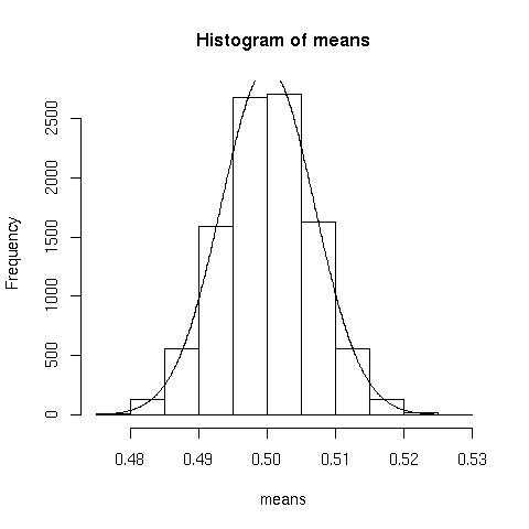 Normal approximation looks pretty good.
And the probabilty plot looks like this:
Normal approximation looks pretty good.
And the probabilty plot looks like this:
plot(sort(means), qnorm(seq(1/10000, 1,1/10000)))
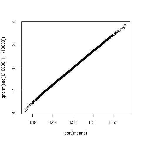 Again looks very good.
| |||||||||
| ||||||||||
| Line: 211 to 248 | ||||||||||
| ||||||||||
| Added: | ||||||||||
| > > |
| |||||||||
| ||||||||
| Line: 127 to 127 | ||||||||
|---|---|---|---|---|---|---|---|---|
Cycling accident data for 2005 | ||||||||
| Changed: | ||||||||
| < < |
See also: Time online, Gov Direct, Repackaged csv. | |||||||
| > > |
See also: Times online, Gov Direct, Repackaged csv. | |||||||
| Load the following file 2005.csv | ||||||||
| Line: 137 to 137 | ||||||||
> blah<-kde2d(stuff$north, stuff$east, n=500)
| ||||||||
| Changed: | ||||||||
| < < |
blah is a list containing 3 items, x and y, representing the grid, and z a 500x500 matrix containing the density value for each item in the grid:
| |||||||
| > > |
blah is a list containing 3 items, x and y, representing the grid, and z a 500x500 matrix containing the kernel density for each cell in the grid:
| |||||||
| Then plot the result: | ||||||||
| Line: 175 to 175 | ||||||||
|
| ||||||||
| Changed: | ||||||||
| < < |
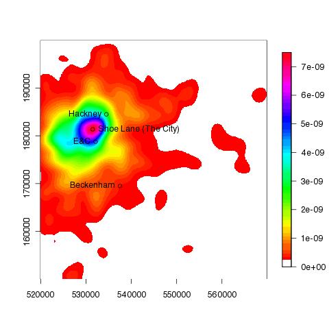
The following plots show the accident hotspot for London, in 2005 (and 2007): | |||||||
| > > |
The following plot show the accident hotspot for London in 2005 was approximately in the region of Shoe Lane: | |||||||
| ||||||||
| Changed: | ||||||||
| < < |
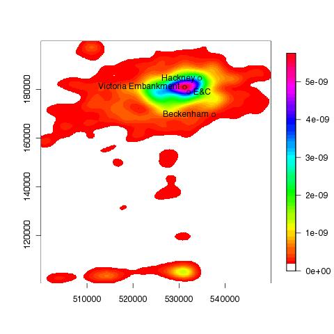
and 2007: | |||||||
| > > |
and Victoria Emabankment in 2007: | |||||||
| ||||||||
| ||||||||||
| Line: 173 to 173 | ||||||||||
|---|---|---|---|---|---|---|---|---|---|---|
|
> text(531496,181359, "Shoe Lane (The City)", pos=4) | ||||||||||
| Added: | ||||||||||
| > > |
The following plots show the accident hotspot for London, in 2005 (and 2007): | |||||||||
|
| ||||||||||
| Changed: | ||||||||||
| < < |
| |||||||||
| > > |
and 2007: | |||||||||
| Changed: | ||||||||||
| < < |
||||||||||
| > > |
| |||||||||
|
TODO nice to add UK boundary to the plots. | ||||||||||
| Added: | ||||||||||
| > > |
| |||||||||
| ||||||||||
| Line: 202 to 210 | ||||||||||
| ||||||||||
| Added: | ||||||||||
| > > |
| |||||||||
| ||||||||||
| Line: 163 to 163 | ||||||||||
|---|---|---|---|---|---|---|---|---|---|---|
| ||||||||||
| Added: | ||||||||||
| > > |
To add a few place names... > points(537500, 169500);text(537500, 169500, pos=2,"Beckenham");points(534500,184500);text(534500,184500, pos=2, "Hackney");points(532108,178763);text(532108,178763, pos=2, "E&C") > points(531496,181359) > text(531496,181359, "Shoe Lane (The City)", pos=4)
| |||||||||
TODO nice to add UK boundary to the plots.
| ||||||||||
| Line: 181 to 199 | ||||||||||
| ||||||||||
| Added: | ||||||||||
| > > |
| |||||||||
| |||||||||||||
| Line: 123 to 123 | |||||||||||||
|---|---|---|---|---|---|---|---|---|---|---|---|---|---|
| which results in approx 303 days. 1/437 is the rate of earthquakes (1/mu). Any quantile can be calculated in this manner. | |||||||||||||
| Added: | |||||||||||||
| > > |
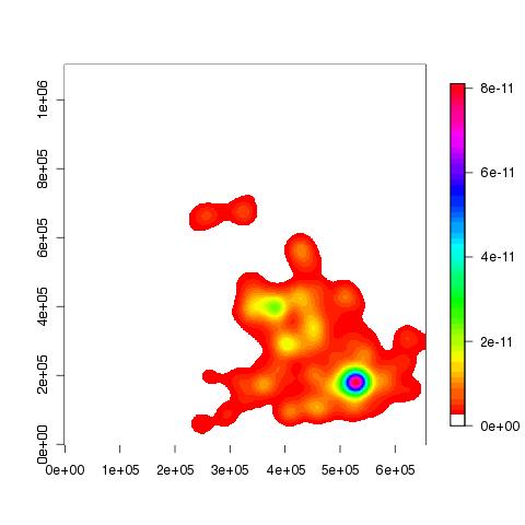
Cycling accident data for 2005See also: Time online, Gov Direct, Repackaged csv. Load the following file 2005.csv> stuff<-scan("2005.csv", skip=1, what=list(year=0,north=0, east=0), sep=',', quiet=T)
Create a density plot of the co-ordinate data (densities are calculated over a 500x500 grid):
> blah<-kde2d(stuff$north, stuff$east, n=500)
blah is a list containing 3 items, x and y, representing the grid, and z a 500x500 matrix containing the density value for each item in the grid:
Then plot the result:
> image(blah, col=c(0, rainbow(50)))
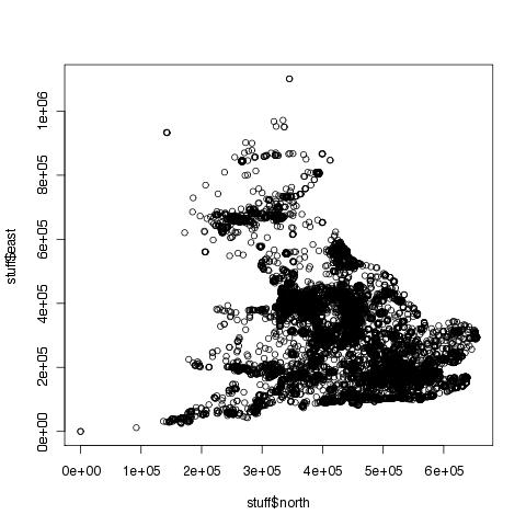
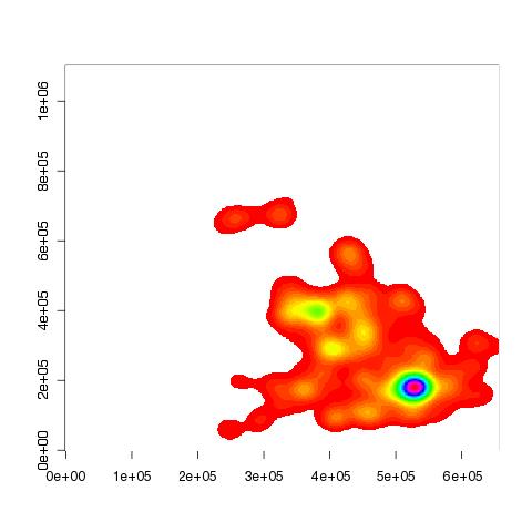 You can see that the above plot is a lot clearer than the following:
> plot(stuff$north, stuff$east)
If you want to add a colour legend to the z-plot above, you'll need to install the fields package:
> install.packages("fields")
> library(fields)
> image.plot(blah, col=c(0, rainbow(50)))
TODO nice to add UK boundary to the plots.
| ||||||||||||
| |||||||||||||
| Line: 135 to 177 | |||||||||||||
| |||||||||||||
| Added: | |||||||||||||
| > > |
| ||||||||||||
| ||||||||||
| Line: 113 to 113 | ||||||||||
|---|---|---|---|---|---|---|---|---|---|---|
> 1-pexp(2*365, 62/27107)
| ||||||||||
| Added: | ||||||||||
| > > |
Quantiles for an exponential distributionThe mean of the interval between serious earthquakes is 437 days (see above for data). The median can be calculated using P(X<= x)=0.5:> qexp(.5, 1/437)
which results in approx 303 days. 1/437 is the rate of earthquakes (1/mu). Any quantile can be calculated in this manner.
| |||||||||
| ||||||||||
| ||||||||
| Line: 41 to 41 | ||||||||
|---|---|---|---|---|---|---|---|---|
Cumalative plot | ||||||||
| Changed: | ||||||||
| < < |
Given the data in the coal.txt, the following command can be used to produce a cumulative plot: | |||||||
| > > |
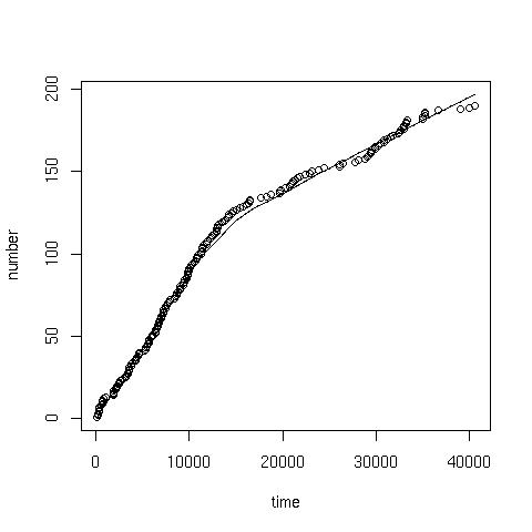
coal.txt contains the interval in days between successive mine explosions. The following command can be used to produce a cumulative plot: | |||||||
> x<-scan("coal.txt") //read data
| ||||||||
| Changed: | ||||||||
| < < |
> time<-cumsum(x) //cumulative sum of the data
| |||||||
| > > |
> time<-cumsum(x) //cumulative 'running' sum of the data
| |||||||
> number<-1:length(x) //sequence from 1:190
| ||||||||
| |||||||||||||
| Added: | |||||||||||||
| > > |
TOC: No TOC in "Home.R" | ||||||||||||
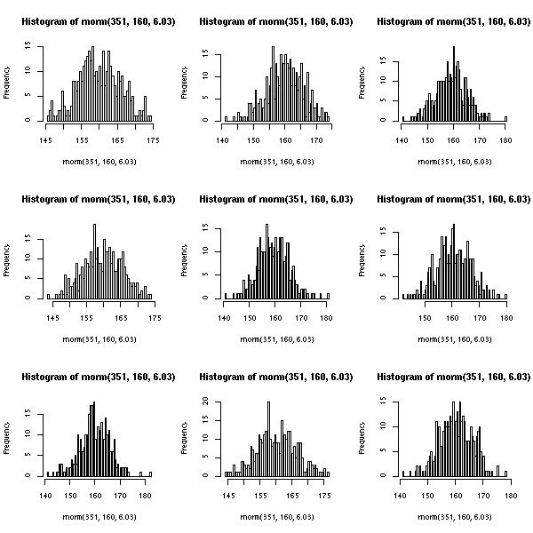
Multiple plotsTo print 4 histograms (with 100 classes) of random normal distribution samples on the same plot, where n=351, mean=160, sd=6.03: | |||||||||||||
| Line: 69 to 71 | |||||||||||||
|---|---|---|---|---|---|---|---|---|---|---|---|---|---|
Note: the syntax to get the mean from the summary is not straight forward. Because summary(...) returns an atomic vector, hence the $ notation cannot be used to (de-)reference the internals of the returned data structure, like it can from say hist(x,y)$counts. The array syntax [] should be used, hence: summary(dec20)['Mean'] to get hold of the mean/mu. You might find it enlightening to issue the following commands: mode(summary(dec20)), mode(hist(x)) to get a feel for the different data structures returned from various functions. You might also like to try attributes(...).
| |||||||||||||
| Added: | |||||||||||||
| > > |
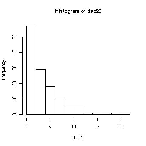
Histograms> hist(dec20) //plots the following
 But can be improved with the following:
> hist(dec20, 23, right=F)
 Notice that the second plot has more groups/classes, and the frequency for 0 is now plotted separately,
 right=F.
Poisson processearth.txt contains intervals in days between major earthquakes.> e<-scan("earth.txt")
The following finds the probability that exactly 5 earthquakes happen in a typical 4 year period:
> dpois(5,((365*3)+366)/summary(e)['Mean'])
And the following finds the probability that fewer than 3 earthquakes happen in a 4 year period:
> ppois(2,((365*3)+366)/summary(e)['Mean'])
The waiting times between successive earthquakes can be described through an exponential distribution, with parameter lambda (rate, number of earthquakes a day).
The probability that the waiting time will be less than the 30 days:
> pexp(30, 62/27107)
and will exceed two years:
> 1-pexp(2*365, 62/27107)
| ||||||||||||
| |||||||||||||
| Line: 77 to 121 | |||||||||||||
| |||||||||||||
| Added: | |||||||||||||
| > > |
| ||||||||||||
Multiple plots | |||||||||||||||||||
| Line: 55 to 55 | |||||||||||||||||||
|---|---|---|---|---|---|---|---|---|---|---|---|---|---|---|---|---|---|---|---|
| |||||||||||||||||||
| Added: | |||||||||||||||||||
| > > |
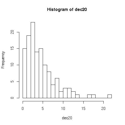
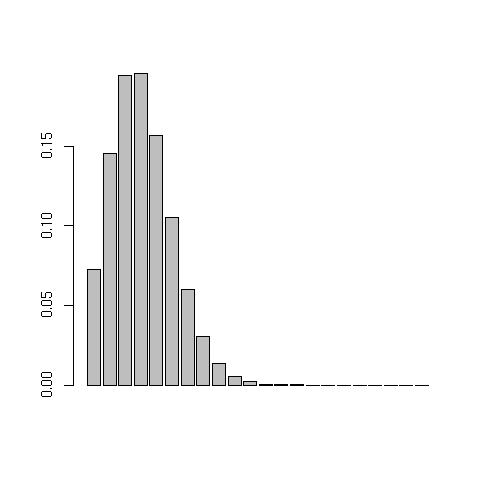
Poisson distributionTo plot a poisson probability function Poission(mu) from the data in dec20.txt, issue the following commands:> dec20<-scan("dec20.txt") //load in data
> barplot(dpois(1:max(dec20),summary(dec20)['Mean'])) //prints the following:
 Note: the syntax to get the mean from the summary is not straight forward. Because
 summary(...) returns an atomic vector, hence the $ notation cannot be used to (de-)reference the internals of the returned data structure, like it can from say hist(x,y)$counts. The array syntax [] should be used, hence: summary(dec20)['Mean'] to get hold of the mean/mu. You might find it enlightening to issue the following commands: mode(summary(dec20)), mode(hist(x)) to get a feel for the different data structures returned from various functions. You might also like to try attributes(...).
| ||||||||||||||||||
| |||||||||||||||||||
| Added: | |||||||||||||||||||
| > > |
| ||||||||||||||||||
| ||||||||||
| Added: | ||||||||||
| > > |
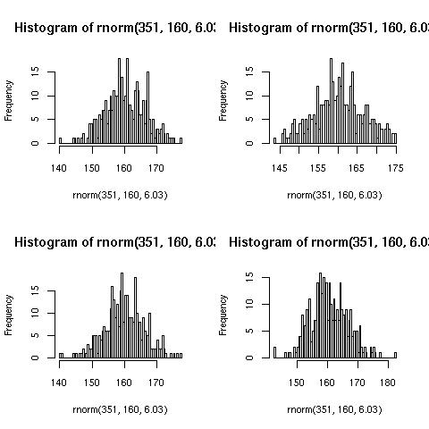
Multiple plots | |||||||||
|
To print 4 histograms (with 100 classes) of random normal distribution samples on the same plot, where n=351, mean=160, sd=6.03:
| ||||||||||
| Changed: | ||||||||||
| < < |
par(mfrow=c(2,2)) for (i in 1:4){ | |||||||||
| > > |
> par(mfrow=c(2,2)) > for (i in 1:4){ | |||||||||
| hist(rnorm(351, 160, 6.03), 100) } | ||||||||||
| Line: 15 to 17 | ||||||||||
|---|---|---|---|---|---|---|---|---|---|---|
|
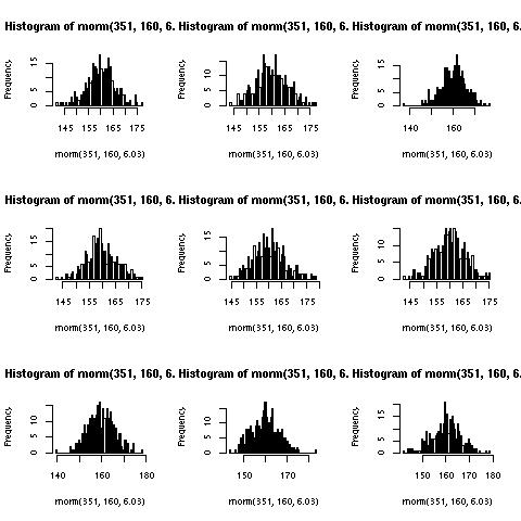
To produce a jpeg:
| ||||||||||
| Changed: | ||||||||||
| < < |
jpeg("~/multiplot.jpg") par(mfrow=c(3,3)) for (i in 1:9){ | |||||||||
| > > |
> jpeg("~/multiplot.jpg") > par(mfrow=c(3,3)) > for (i in 1:9){ | |||||||||
| hist(rnorm(351, 160, 6.03), 100) } | ||||||||||
| Changed: | ||||||||||
| < < |
dev.off() | |||||||||
| > > |
> dev.off() | |||||||||
| Which produces the following image: | ||||||||||
| Line: 29 to 31 | ||||||||||
| Note: The dimensions of the image are 480x480 pixels, hence the titles being truncated. The following is more appropriate: | ||||||||||
| Changed: | ||||||||||
| < < |
jpeg("~/multiplot.jpg", 600, 600)
| |||||||||
| > > |
> jpeg("~/multiplot.jpg", 600, 600)
| |||||||||
| ||||||||||
| Added: | ||||||||||
| > > |
Cumalative plotGiven the data in the coal.txt, the following command can be used to produce a cumulative plot:> x<-scan("coal.txt") //read data
> time<-cumsum(x) //cumulative sum of the data
> number<-1:length(x) //sequence from 1:190
> plot(time, number) //giving:
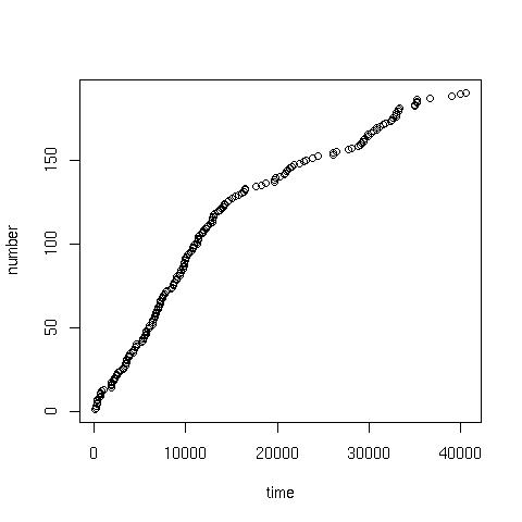
> scatter.smooth(x=time, y=number) //or a scatter with smoothed curve overlay:
| |||||||||
| ||||||||||
| Added: | ||||||||||
| > > |
| |||||||||
| ||||||||
| Line: 12 to 12 | ||||||||
|---|---|---|---|---|---|---|---|---|
Gives the following plot (yours may differ because of randomness):
| ||||||||
| Changed: | ||||||||
| < < |
If you want to produce a jpeg do the following: | |||||||
| > > |
To produce a jpeg: | |||||||
jpeg("~/multiplot.jpg")
| ||||||||
| Line: 20 to 20 | ||||||||
| for (i in 1:9){ hist(rnorm(351, 160, 6.03), 100) } | ||||||||
| Added: | ||||||||
| > > |
dev.off() | |||||||
Which produces the following image:
| ||||||||
| Added: | ||||||||
| > > |
Note: The dimensions of the image are 480x480 pixels, hence the titles being truncated. The following is more appropriate:
jpeg("~/multiplot.jpg", 600, 600)
| |||||||
| ||||||||
| Added: | ||||||||
| > > |
| |||||||
| Line: 1 to 1 | ||||||||||
|---|---|---|---|---|---|---|---|---|---|---|
| Added: | ||||||||||
| > > |
par(mfrow=c(2,2))
for (i in 1:4){
   hist(rnorm(351, 160, 6.03), 100)
}
Gives the following plot (yours may differ because of randomness):
If you want to produce a jpeg do the following:
jpeg("~/multiplot.jpg")
par(mfrow=c(3,3))
for (i in 1:9){
 hist(rnorm(351, 160, 6.03), 100)
}
Which produces the following image:
| |||||||||
Revision r1.1 - 06 Mar 2009 - 19:59 - ChrisJones
Revision r1.13 - 29 Jan 2010 - 10:00 - ChrisJones
Revision r1.13 - 29 Jan 2010 - 10:00 - ChrisJones